How to
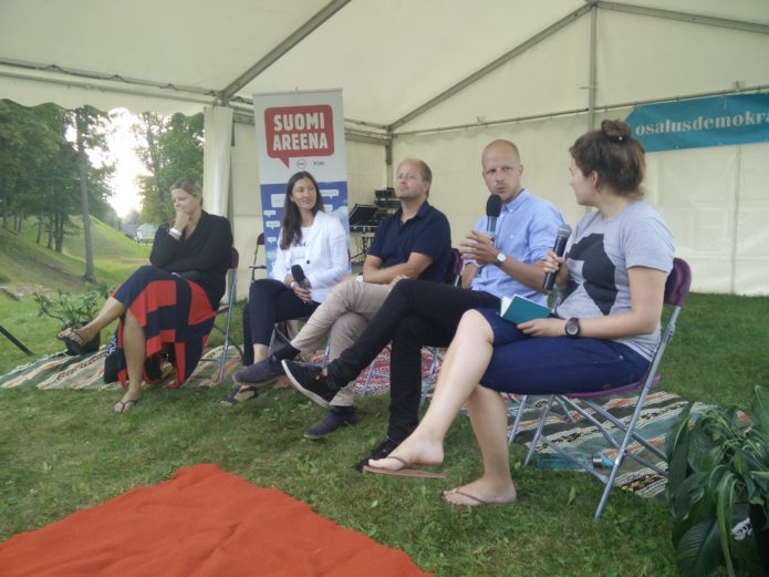
humanise the user experience, and make the functions of software better reflect users’ needs, was the topic being discussed in English at a lunchtime debate during the Opinion Festival on Friday. Each of the panellists came from a technology-related background, although looking at its use and application in differing ways.
Genia Trofimova is the Product and Project Manager for Mooncascade, a software development agency with a number of high-profile clients. A story she told illustrated a company working closely with its client for an optimal user experience. “A customer from Wall Street said he wanted ‘Tinder for Wall Street’ and asked if we could make it, and I said ‘sure’, and all of our team installed Tinder – it was fun. We explored what ‘Tinder for Wall Street’ meant, and then, three months into development and design, we went into very intense user testing. We built this trust, and the client in New York, the team in Seattle, everybody listened to what our team has to say; we want to keep our team happy, and people want to participate and show their talents.”
Ede Schank Tamkivi, from the Eesti 2.0 non-governmental organisation, was moderating the discussion, and began a discussion of good and bad user experiences with an awkward encounter with an Estonian state portal. “I had the experience when registering the birth of my child – I went to rik.ee [an Estonian government website], clicked on the drop-down menu, and the first option displayed was stillbirth, which is not a great thing for a new mother to have to see or think about.”
Jaanus Kase, Head of Product Design at Pipedrive, continued the subject of childcare. “When you have a child, there are about seven or eight different kinds of support you can apply for, depending on whether the child is disabled, or you’re a foster parent, or other things. Your day is full of things not related to filling out these forms, then at night you have maybe ten minutes to fill out the forms, and you get this long list of options.”
“Some kind of easy option would be great, but you get a long list. I would diminish the [list of] options, say if it’s my own child or a foster child, then in Estonia the system can tell where you’re living, so it could give me the options related to my local government. More to the point: why do I even have to do any activity myself? Why can it not be done for me?”
Trofimova responded to an audience question about whether users of apps that change their user interface, and are unhappy about this, are somehow too picky. “It’s still information,” Trofimova said, “and it brings a lot of information about comfort zone, and how far we can go with changes. There is no such thing as too picky – we just need to be picky how we take that information into account.”
Markus Villig, CEO of Taxify, an Estonian-founded driver-requesting app that uses both private drivers and licensed taxi companies, found that his product was mentioned by many panellists and audience members over the course of the 90-minute discussion, primarily because the app has become an integral part of the lives of many people in Estonia and other countries in which it has been rolled-out. While several people said they used Taxify every day, and praised its user experience, others pointed out the recent update that took away the user’s choice of specific taxi operator and car. For Villig, this was an example of making the user experience better in the long term by taking away a choice.
“This is a question we debated internally for one to two years. We have power-users who want to see all the information about a car before they pick it, and they run a sort of internal algorithm to decide which one to take. There’s always a question how much information you include. But people get out of the club, and most people in that situation just want the nearest car, as cheap and as fast in arriving as it can be. Those sorts of people are not usually so interested in picking from a long list of cars.”
“Then we started to look at whether we could fundamentally make the service better. If we can make the pickup shorter, drivers can waste less fuel, waste less time and make more pickups per hour. That’s why when you choose a car, which might be the same kind of car at the same price, but might be two kilometres further away, it creates a waste of fuel and mileage. We need to simplify it so that people cannot make sub-optimal choices. Ultimately this means that the driver earns more, it means the whole platform’s quality goes up, and so on.”
Kase added, “it’s about testing and data. There is no good design that can be isolated from the impact it has on its business. There is a difference between what people say they will do and what they do in reality. A great example of that is in politics – a lot of Americans said they would move to Canada after Trump got elected, but how many have done that?”
“If it looks good but doesn’t produce results, it’s not good design. The other thing to think about regarding whether or not people are too picky is to look at where this discussion is happening. It’s happening online, on platforms like Facebook and Twitter; these are not public services, they are commercial enterprises, pushing us around, actively enticing us to have a discussion there, so they can make more money off us. Most people don’t think about that. The noise surrounding the things versus what actually happens are two different things.”
Villig, like many tech CEOs an admirer of Apple legend Steve Jobs, cited a remark he made. “Steve Jobs was right when he said ‘people don’t know what they really want.’ People make a lot of noise, and it’s important to listen to that, but you won’t see how people really react until the product is actually launched.”




 al’s presence in the media, but I hadn’t even been to Paide that much before, let alone participated in the festival. So it was time to open my mailbox and write an email to Liis.